
Pneu Store
Interface design project for the new Pneu Store app, focused on the mobile experience of a tire shop that operates in both online and offline retail, offering a wide variety of products.
This project was officially developed in Portuguese, so the images are in that language. However, the overall project explanation is available in both languages.
Methodology
The Double Diamond is a design approach that organizes the creative process into four phases: Discover, Define, Develop, and Deliver. This methodology helps ensure that the problem is well understood and that the solution is effective.

Discover
Understandingthe Problem
The project emerged from a clear limitation in the mobile experience. Although the company already had an e-commerce website and a mobile browser version, this view was not ideal for users.
Navigation made it difficult to find products and complete purchases, directly impacting conversion. As a result, it was decided to implement a dedicated app to make the mobile experience more seamless, intuitive, and efficient.
CSD Matrix
The CSD matrix is a tool used for analyzing and defining problems and solutions. It consists of three categories to be defined: Certainties, Suppositions, and Doubts. This matrix helps organize thinking and direct actions to solve problems more effectively. Based on the matrix, I usually create a list of general ideas that can be applied to possible solutions.
Certainties
.jpg)
Suppositions
.jpg)
Doubts
.jpg)
Target Audience
Men and women aged 30 to 50, who are always on the go, love the open road and have a habit of shopping via mobile phone.

Brands Analyzed
Key Insights
-
None of the three apps require users to create an account to browse products—only at checkout—which I consider a good choice.
-
B2 Pneus has a more complete product search screen with advanced filters, while the other two are more basic. This filtering approach greatly helps users find what they are looking for. The B2 app also displays recent searches in a list.
-
Both the Titan and B2 Pneus apps have bottom navigation menus that support usability; however, Titan’s menu is floating, and I didn’t see a technical or usability reason for this choice.
-
The Titan app is available in Spanish for eight Latin American countries and in Brazilian Portuguese. Its contact page is basic, using only a form, which makes response time and communication optimization with customers slower.
-
The PneuDrive app has a stronger sales appeal. The header search is basic, but just below it there is a search form that considers tire width, profile, and rim size for a more targeted search. PneuDrive also includes a WhatsApp icon for direct contact with a consultant who can answer questions and assist with purchases.
-
The main friction points in the online tire purchasing journey are: lack of technical understanding, difficulty in choosing, lack of assistance, and poor usability.
Benchmark
Define
Experience Strategy
How can we ensure a smooth and intuitive navigation experience for a user who may not be familiar with technical tire details?
-
Divide products by segments.
-
Ask users to define their interests to filter product types and promotions from the start.
-
Use auto-fill and smart suggestions.
-
Use badges for best-selling products.
-
Create lists of best products for each situation, such as “best tires for motorsports” or “most durable tires for agricultural machinery.”
-
Provide comparison tables within the site, comparing prices, brands, and materials, for example.
How can we ensure that a non-expert user chooses the right tire for their vehicle?
Use language appropriate to the audience, concise copy in calls-to-action and titles, optimized and intuitive usability, allow users to request assistance, and make choices easier through blog content, rankings of best tires for bike trails, for example, or badges such as “best seller,” “top rated,” and “best for trails.”

Design System
Material Design DS is a set of guidelines, components, and tools developed by Google to create consistent, intuitive, and responsive user interfaces. It uses design principles based on paper and ink, combining classic design elements with technological innovations to offer a harmonious user experience across different devices and platforms.
Qualitative Research
A questionnaire was administered to 5 parents and their 6 children.
As a result, it was understood that all the children interviewed above the age of 7 usually play games on their cell phones, often have environmental education initiatives in schools, and tend to separate waste.
Most parents keep broken electronic equipment at home with the intention of repairing them in the future.
Best Practices
What UX best practices can be applied to increase sales conversion?
-
Login via Google account or social media
-
Clear and accessible language
-
Remove unnecessary information and elements
-
Clean and objective interface
-
Maintain consistency to facilitate recognition
-
Proper contrast and good readability
-
Reduce the number of clicks
-
Easy-to-understand flows
-
Keep users informed about the status of the entire purchase process and their position within the system
-
Continuous testing and iteration
Develop &
Delivery
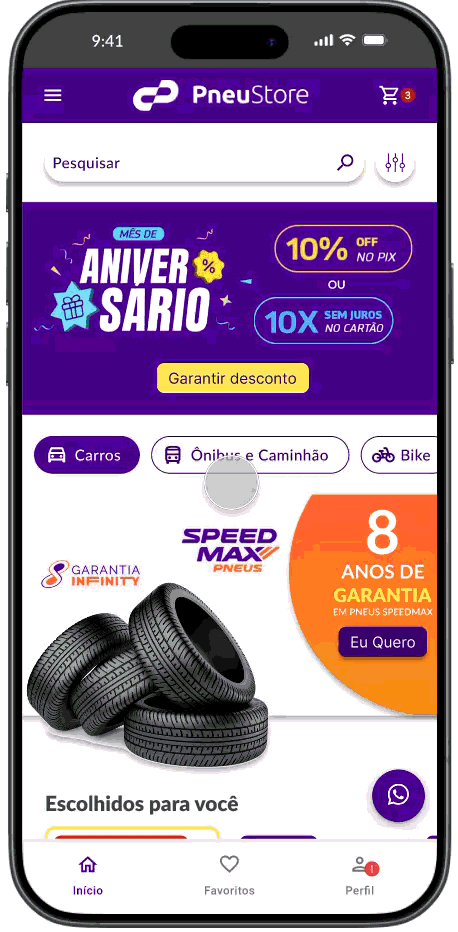
Final Prototype
The high-fidelity prototype is the most accurate and detailed representation of how the interface will perform once the app is released. It simulates the final appearance and interactions, including visual elements, behaviors, and transitions, providing a realistic view of the user experience. This prototype is used to test and validate usability, ensure that all aspects of the interface align with the final design, and offer a concrete vision of the product before the final implementation.


FAV
ICON
_edited.png)